 Nuvirs
Product photography
Fall Beauty Product Photography: 3 AI Background Ideas
Turn Pinterest’s October 2026 beauty trends into original product photo concepts: frosted silver, cozy fragrance and coffee tones, with editable AI prompts.
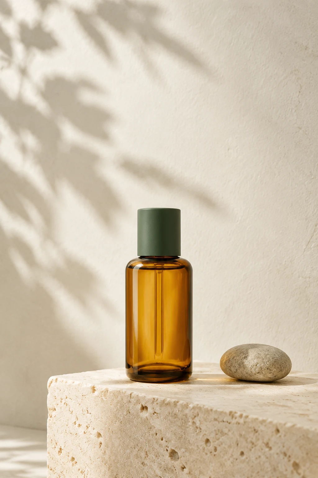
Use a trend to choose the mood around your product, then keep the product itself accurate. Start with a clear reference photo and compare three distinct backgrounds: icy silver, soft gourmand neutrals and coffee-colored surfaces.
What the October report actually tells us
Pinterest published its first Beauty Trend Report on October 6, 2026. It reports growth in searches including “frosted makeup” (+286%), “marshmallow perfume” (+248%) and “coffee nails ideas” (+922%). The source identifies these as global text searches, comparing July 2026 with July 2025. They are signals of interest on Pinterest, not sales figures or measurements of demand for AI product photography.
For a small beauty brand, the useful takeaway is specificity. Instead of asking for a generic luxury background, build a scene around one finish, one material and one lighting direction. The three concepts below are our original photography interpretations of the report, rather than reproductions of its campaign images.
Prepare a reference that can survive the edit
Use a photograph you own or have permission to edit. Place the product on a plain surface, keep the full silhouette in frame and avoid strong reflections over the label. A large, sharp product in the reference gives you a more useful starting point than a tiny bottle in a busy room.
Choose the final placement before generating: centered for a product page, or off-center with quiet space for a social headline. Add final typography in your layout tool. AI can change labels, volume markings, cap shapes and color even when the prompt asks it to preserve them; compare every candidate against the source photograph.
1. Frosted silver for reflective packaging
The report’s Arctic Frost direction suggests a cool setting for chrome caps, clear glass or pearlescent packaging. Use a matte pale-blue surface to separate the product from a reflective background. One restrained silver element usually gives a clearer hierarchy than surrounding the bottle with metallic props.
Watch the edges of transparent containers: bright reflections can erase their outline. Reject a result if the glass looks melted, the cap changes shape or the generated reflection shows a second label.
PROMPT TO ADAPT
Edit the uploaded product photo into a cool editorial still life. Keep the original bottle silhouette, cap, label, logo and product color as closely as possible. Place it on a matte pale-blue surface with a softly blurred brushed-silver backdrop. Use broad side lighting, a subtle grounded shadow and restrained highlights. Keep the product dominant and leave empty space above it. No added text, no extra products, no altered packaging.
2. Cozy neutrals for a fragrance mood
Pinterest’s Eau So Cozy theme points toward comforting fragrance imagery. Translate that feeling through cream paper, warm stone and soft folds, rather than assuming every fragrance contains vanilla or marshmallow. A visual prop can imply an ingredient, so use scent-specific props only when they match the actual product.
Keep the color temperature warm but the label neutral enough to read. Amber bottles can disappear into brown backgrounds; introduce a pale surface behind the outline or shift the light to create separation.
PROMPT TO ADAPT
Create a warm fragrance product-photo concept from the uploaded reference. Preserve the bottle and packaging details as closely as possible. Use a pale limestone surface, an ivory fabric fold in the distance and soft late-afternoon side light. Create a quiet, comforting atmosphere with realistic contact shadows. No food, no ingredient props, no people, no added words. Keep the product label unobstructed and the composition simple.
3. Coffee tones for autumn color stories
The report’s Latte Lacquer theme is about nail colors inspired by drinks and desserts. For product imagery, the transferable element is the palette: espresso, caramel and milky beige. A two-tone paper sweep can suggest that mood without placing the product in food or inventing a flavor claim.
Try this with products whose real packaging already fits the palette. If the product is bright pink, use the contrast deliberately; do not prompt the model to recolor the actual contents just to match the trend.
PROMPT TO ADAPT
Restyle the background of the uploaded product photograph using espresso-brown and milky-beige paper surfaces. Preserve the actual product color, bottle proportions, cap and printed label as closely as possible. Use soft studio light and a clean, believable shadow. Compose the product slightly left of center with clear space on the right for text added later. No coffee beans, no liquid splashes, no invented claims, no additional lettering.
A practical workflow before publishing the image
Open the product background tool, upload the reference and paste one prompt into Studio. Review the displayed credit quote before submitting. Generate and inspect one direction before spending credits on more variations. These prompts are starting briefs; the illustration on this page is not a test result for them.
- Compare the generated product with the original at full size: label spelling, logo, cap, proportions, material and color.
- Check for duplicate bottles, impossible shadows, floating edges and props that suggest unsupported ingredients.
- Crop a thumbnail and confirm that the product is still the first thing you see.
- If exact packaging is essential, keep a verified cutout of the original product in your final composite using an image editor.
- Publish an accurate caption and descriptive alt text. Follow the destination marketplace’s product-image requirements.
Sources & editorial notes
- Pinterest Beauty Trend Report 2026
Published October 6, 2026. Search-growth figures use Pinterest internal global text-search data, July 2025 versus July 2026. Read October 7, 2026.
Written by Nuvirs. Trend references inform the topic; the workflow and prompts are our own. Mentioned brands do not sponsor or endorse this guide.
Make the idea your own.
Bring a reference photo to Studio, paste a prompt and review the credit quote before creating.