 Nuvirs
Color planning
Fall Room Color Ideas 2026: Compare 3 Palettes with AI
Compare chocolate brown, bottle green and oxblood in your own room photo. Get practical fall palette advice, AI editing prompts and a paint-sample checklist.
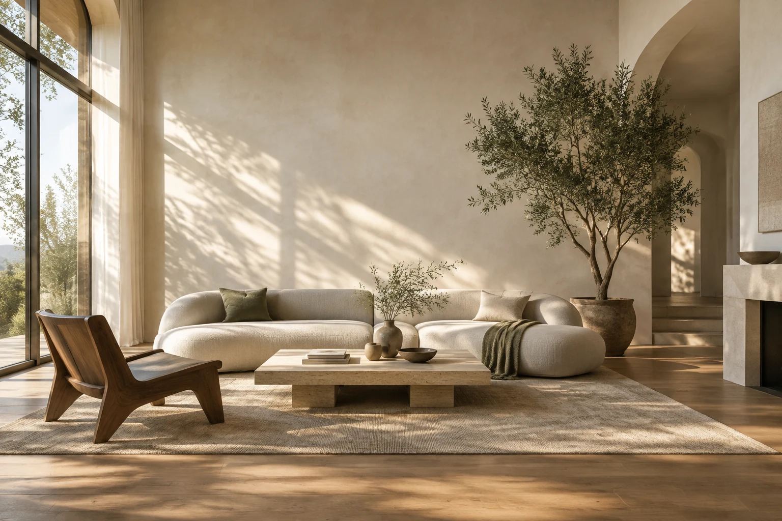
Try one fall color at a time on the same room photo. Chocolate brown can anchor light upholstery, bottle green can connect with wood, and oxblood can add depth to a small accent area. Compare the concepts before ordering physical samples.
A current palette, grounded in a real source
Homes & Gardens’ fall color report, updated August 27, 2026, includes chocolate brown, bottle green and oxblood among ten shades discussed by designers for the season. It is editorial guidance, not a ranked search-volume report. We have selected these three because they create visibly different directions that are useful to compare in a room photograph.
The decision starts with what stays: flooring, a sofa, curtains, stone or timber. A trending color should work with those surfaces. Before choosing a palette, note whether the room’s fixed materials are warm, cool or mixed, and which wall receives the most daylight.
1. Chocolate brown with cream and pale blue
Chocolate brown gives a light room a darker anchor. Try it on a single wall, a cabinet or an upholstered piece while keeping cream around windows. A small pale-blue accent can break up a scheme that otherwise reads as several similar browns.
If the room already has dark flooring, begin with a smaller brown area. Ask the image model to leave the floor and sofa unchanged so you can judge that relationship. A successful composition in a bright render still needs checking against the room’s real evening light.
PROMPT TO ADAPT
Edit the uploaded living-room photo to compare an autumn color palette. Change only the wall behind the main seating to a warm chocolate-brown paint concept. Keep the camera position, doors, windows, floor, sofa shape and furniture positions as closely as possible. Retain cream on the remaining walls and introduce one pale-blue cushion. Preserve the original daylight direction. No new architectural features, no added furniture and no text.
2. Bottle green with timber and linen
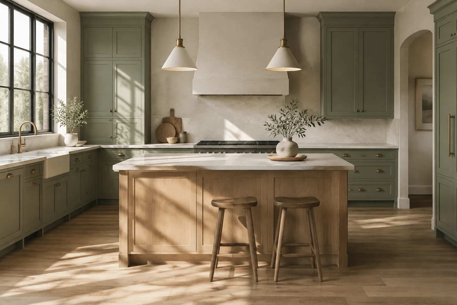
Bottle green has more depth than a pale sage and can give warm timber a strong backdrop. Pair it with an oatmeal curtain or natural linen rather than adding several competing greens. In a kitchen, preview the cabinet fronts first and keep the countertop and backsplash fixed.
The important comparison is at the boundary between surfaces. Does the green make the wood look warmer or more orange? Does it sit well beside the existing tile? Inspect those junctions before deciding that the whole palette works.
PROMPT TO ADAPT
Use the uploaded kitchen photo to preview bottle-green cabinet fronts. Preserve the existing cabinet layout, handles, countertop, backsplash, sink, appliances, floor, windows and camera angle as closely as possible. Keep natural wood tones unchanged and use the original room lighting. Change the cabinet-front color only, with a subtle satin finish. No new island, no extra shelving, no changed wall openings and no lettering.
3. Oxblood with warm white and a restrained accent
Oxblood can make a small reading corner feel more enclosed and deliberate. Test it on an existing bookcase or the wall behind a chair, with warm white elsewhere. If you prefer an accessory change, keep the walls and introduce the color through a cushion or lampshade instead.
Deep red can shift toward purple or brown depending on surrounding light. Use the AI result to choose the amount of color you enjoy, then use a real paint or textile sample to choose the actual hue. Digital previews cannot establish the finish or undertone you will see at home.
PROMPT TO ADAPT
Edit this room photo to preview a restrained oxblood accent. Apply a deep brownish-burgundy color to the existing wall behind the reading chair only. Keep other walls warm white. Preserve the chair, flooring, windows, doors, furniture scale, camera angle and original lighting as closely as possible. Retain natural textures. Do not add a fireplace, bookcase, window, decorative text or extra furniture.
Keep the comparison useful
Use the same original photo for every direction. Editing a previous AI result can gradually change the room, so it becomes harder to tell whether you prefer the color or the newly invented furniture. In Studio, upload your photo, paste the relevant prompt, review the quote and inspect one result at a time.
Start with a single surface, then expand only if the first result looks promising. For a kitchen, the cabinet color tool is the closest starting point. For a living room or reading nook, use the interior design tool. Playground is useful for broader preset-based style exploration; the detailed color briefs above belong in Studio.
- Check that doors, windows, furniture positions and the camera viewpoint still match the source.
- Compare the changed surface next to flooring, countertops and upholstery that you will keep.
- Reject results that invent more light or extra space to make a dark palette look better.
- Shortlist one or two directions, then order physical paint or fabric samples.
- View samples in morning, afternoon and artificial light before committing to a purchase.
What a color preview can help you decide
An AI preview can help answer whether you prefer a dark or light scheme, which surface should carry the strongest color and how much contrast feels comfortable. It cannot reliably match a paint manufacturer’s shade, predict the effect of a finish or replace a decorator’s site assessment.
Save the original and your preferred concept together with a short note about what should change. That gives you a useful brief to discuss with a painter or designer, while measurements, surface preparation and final paint selection stay grounded in the actual room.
Sources & editorial notes
- Homes & Gardens: Fall Color Trends 2026
By Chloe Frost-Smith, published August 17 and updated August 27, 2026; read October 7, 2026. Designer commentary supports the palette selection, not a claim of measured search popularity.
Written by Nuvirs. Trend references inform the topic; the workflow and prompts are our own. Mentioned brands do not sponsor or endorse this guide.
Make the idea your own.
Bring a reference photo to Studio, paste a prompt and review the credit quote before creating.
See pricing and credits · For preset-based room ideas, try Playground.